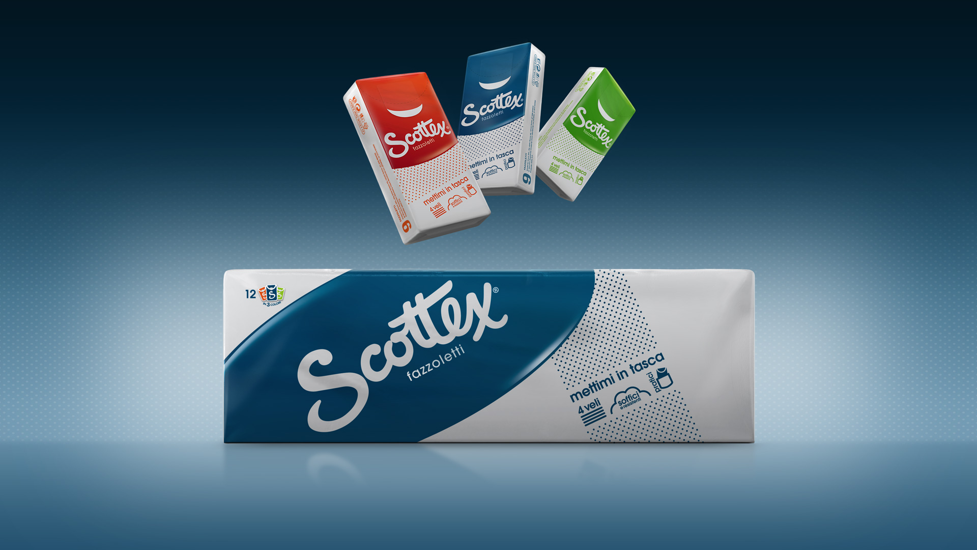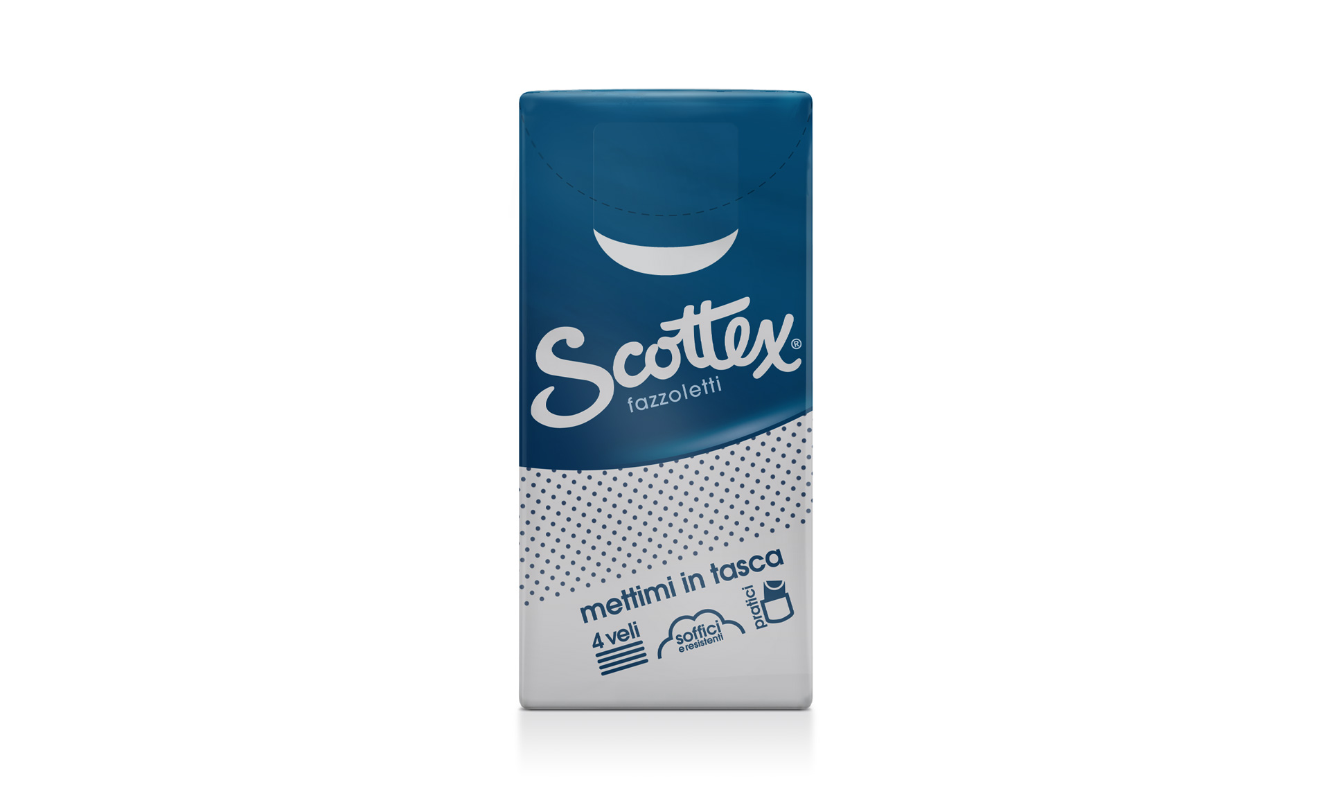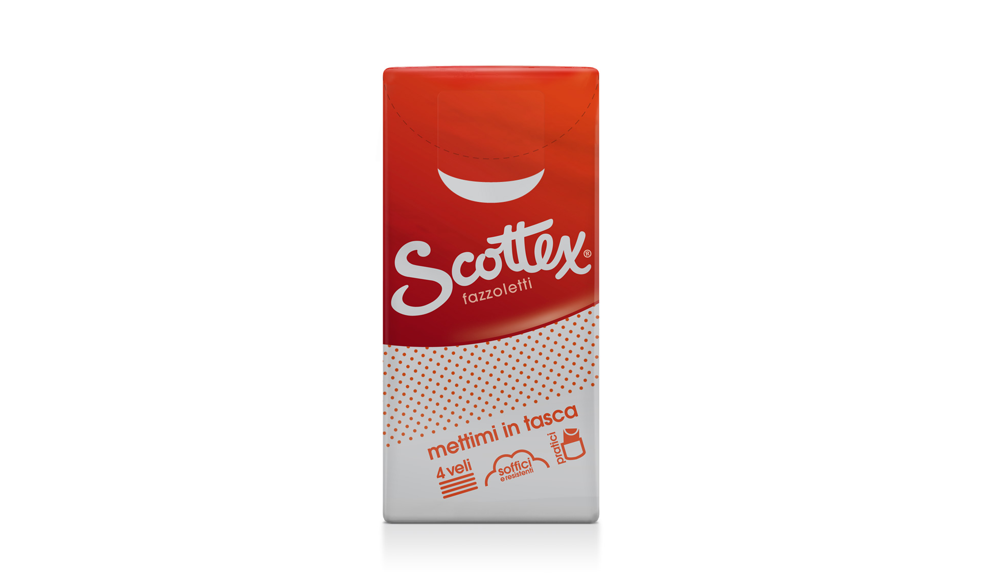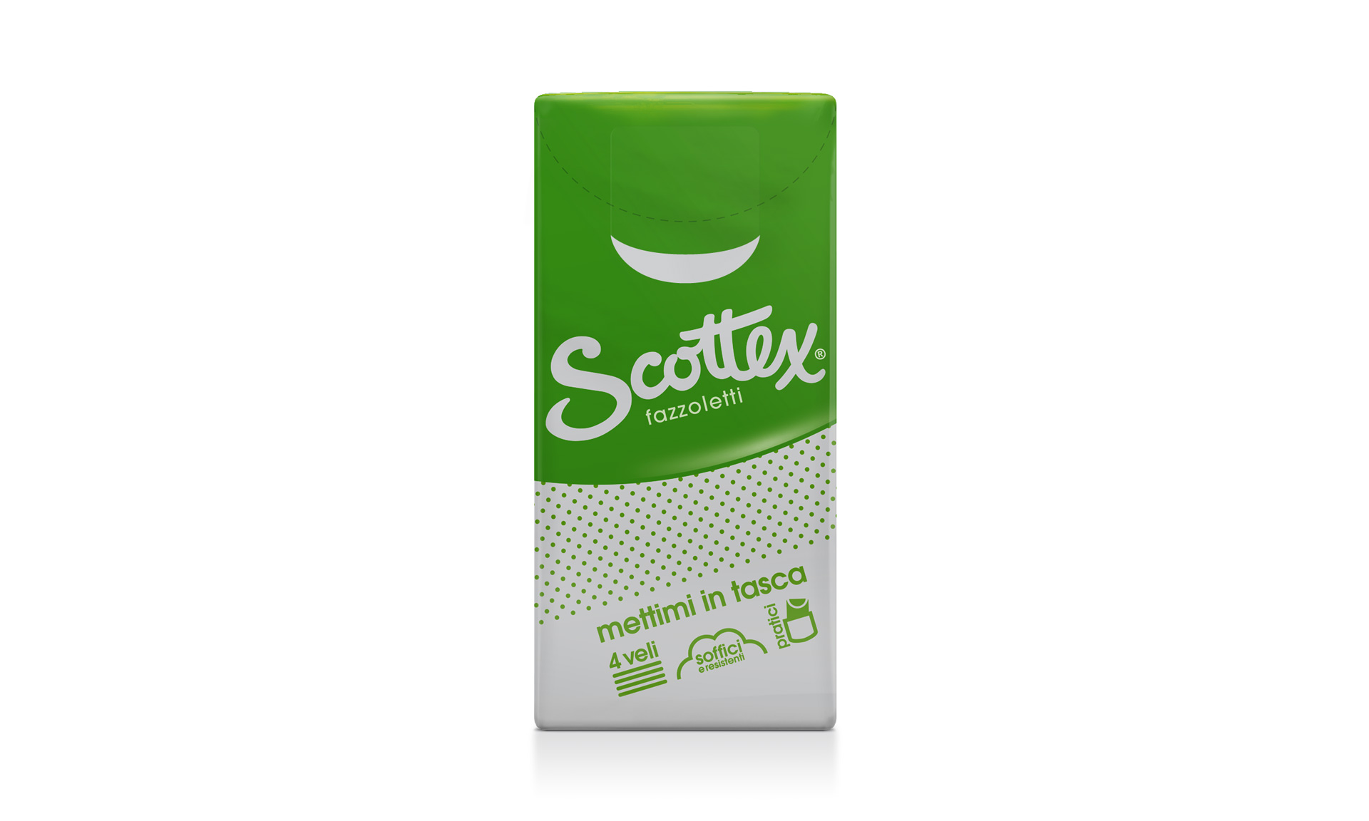
Scottex is mostly associated to toilet paper and stands for softness and quality guarantee. Neverthless, its range of pocket tissues had shown some weaknesses, such as poor brand identity and visibility. ARC’S interpreted its restyling with the objective to reinforce the identity of Scottex pocket tissues, by defining a visual system exalting the Scottex brand and connecting the product to the brand. The result is a strong visual identity that gives back impact to the Scottex brand and expressive strength to pocket tissues as well, improving shelf visibility.
Colours have been an extremely important identity element. The use of paste silver as serigraphy base gives new intensity and to each colorful pack.


