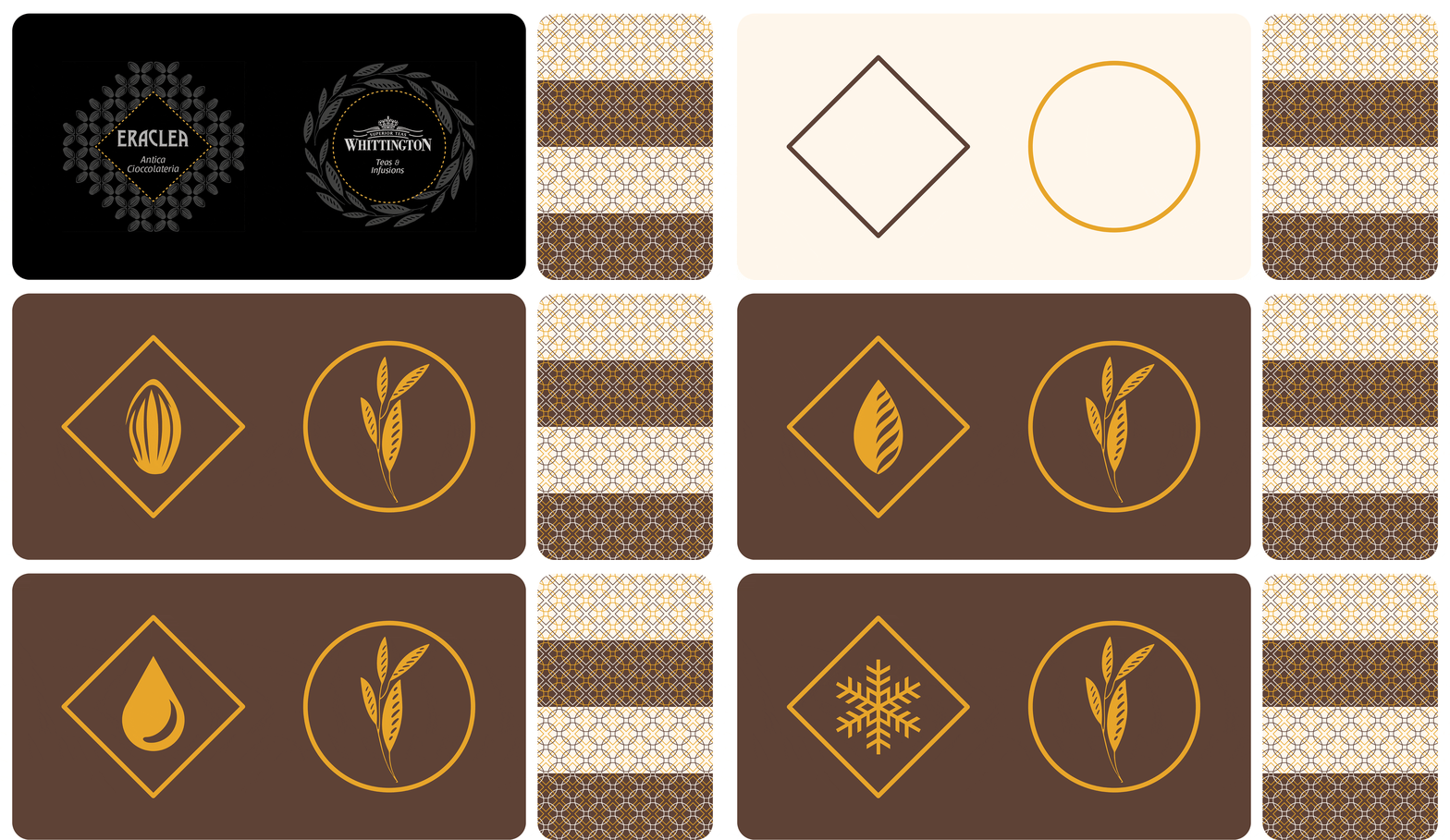

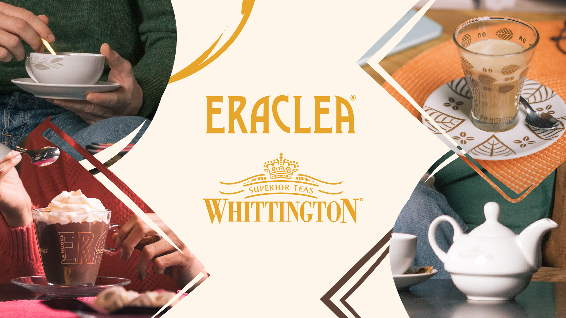
Eraclea and Whittington needed an identity that felt sharper, more structured, and aligned with today’s visual landscape. The goal was to create a system that clarified their positioning and redefined how they shape out-of-home breaks, making these moments more distinctive and engaging.
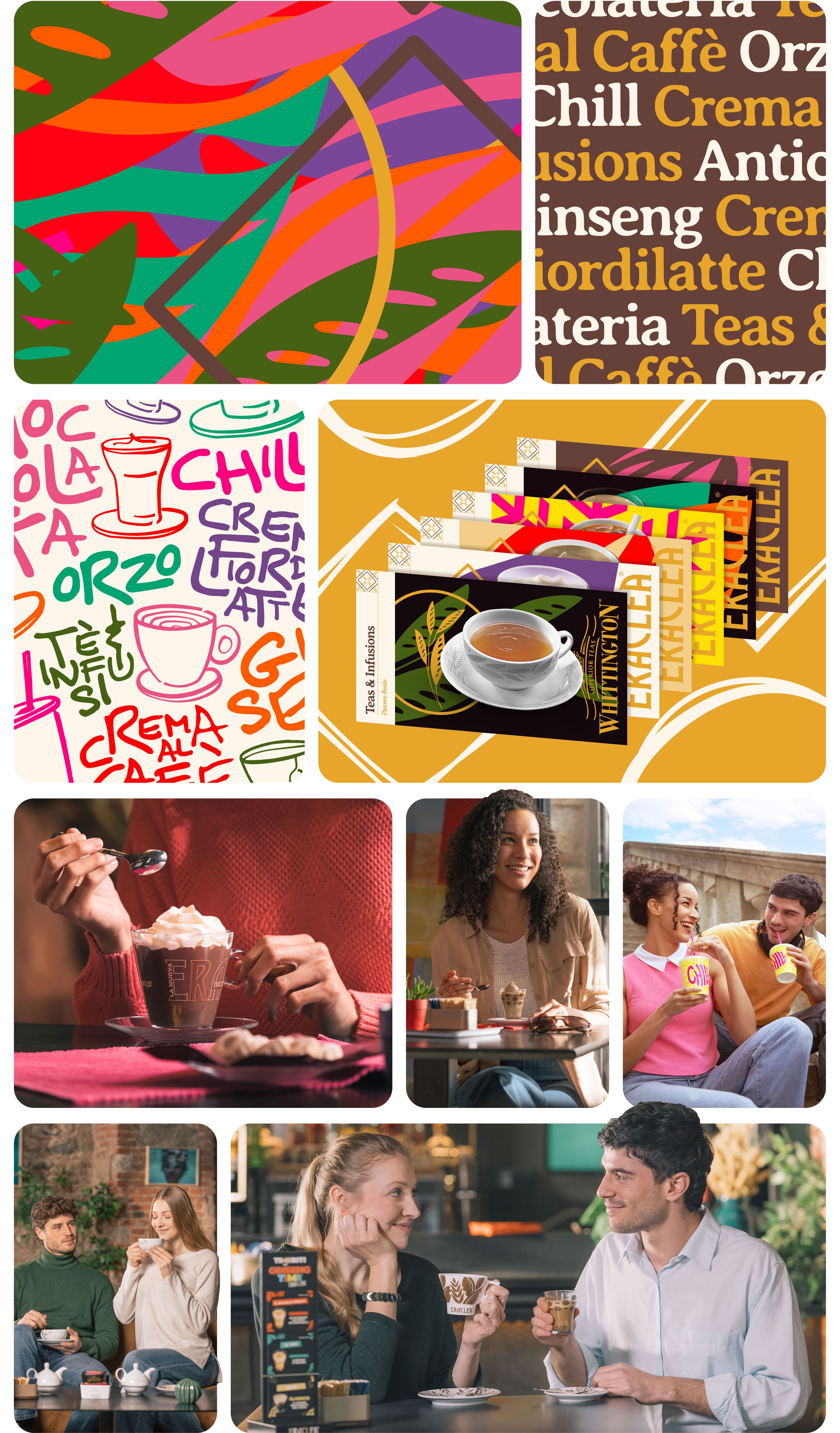
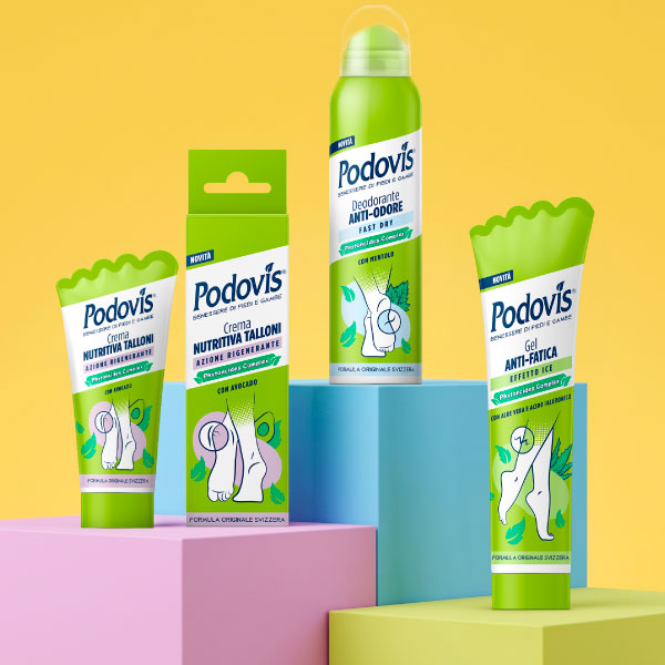
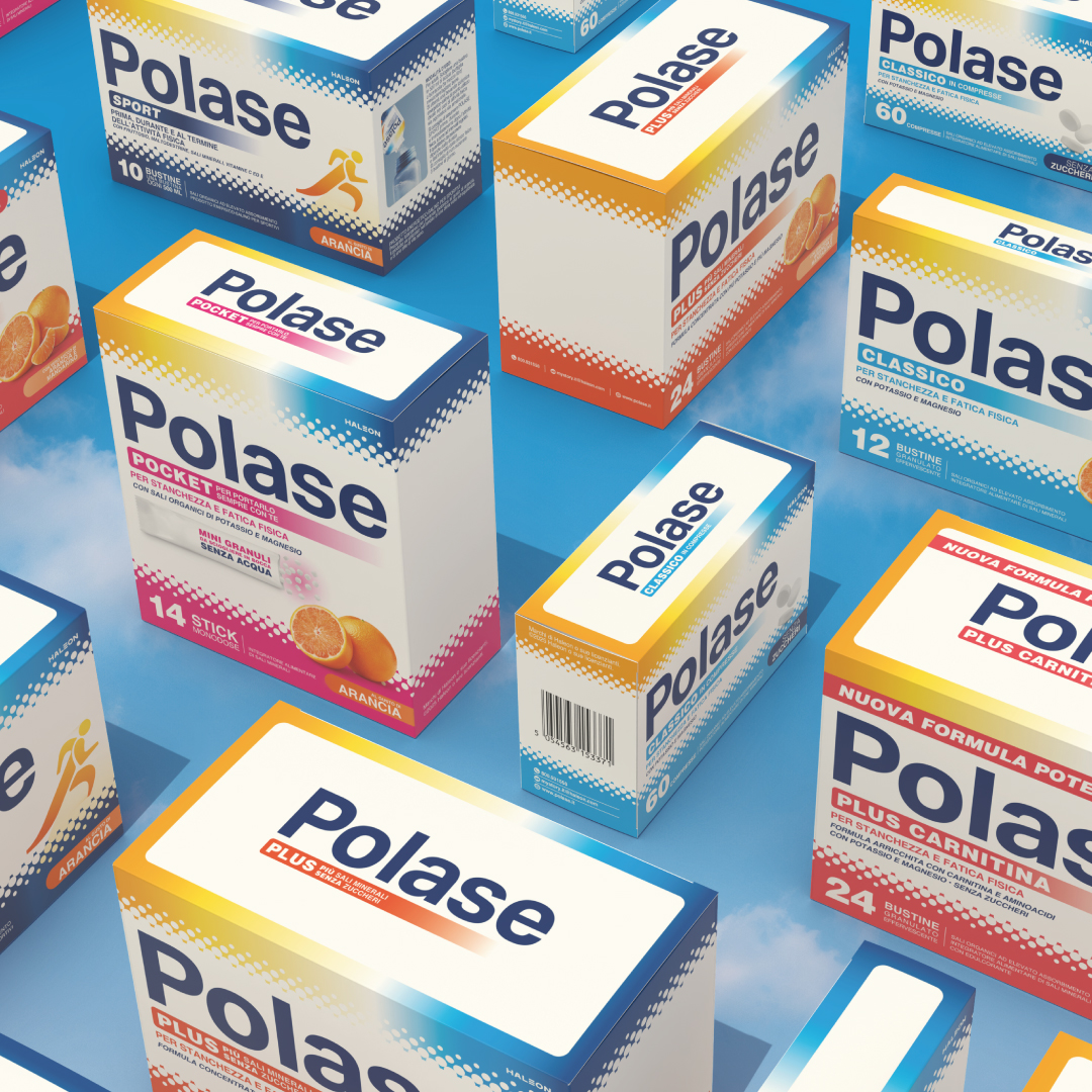
The answer followed the trending principles of Dopamine Design, a language of bold colors, striking shapes, and instant visual impact. The real breakthrough came with the mood-driven approach, the strategic insight that shifted the entire communication. The switch became the foundation of the new brand system, with the new identity built around the emotions the products evoke.
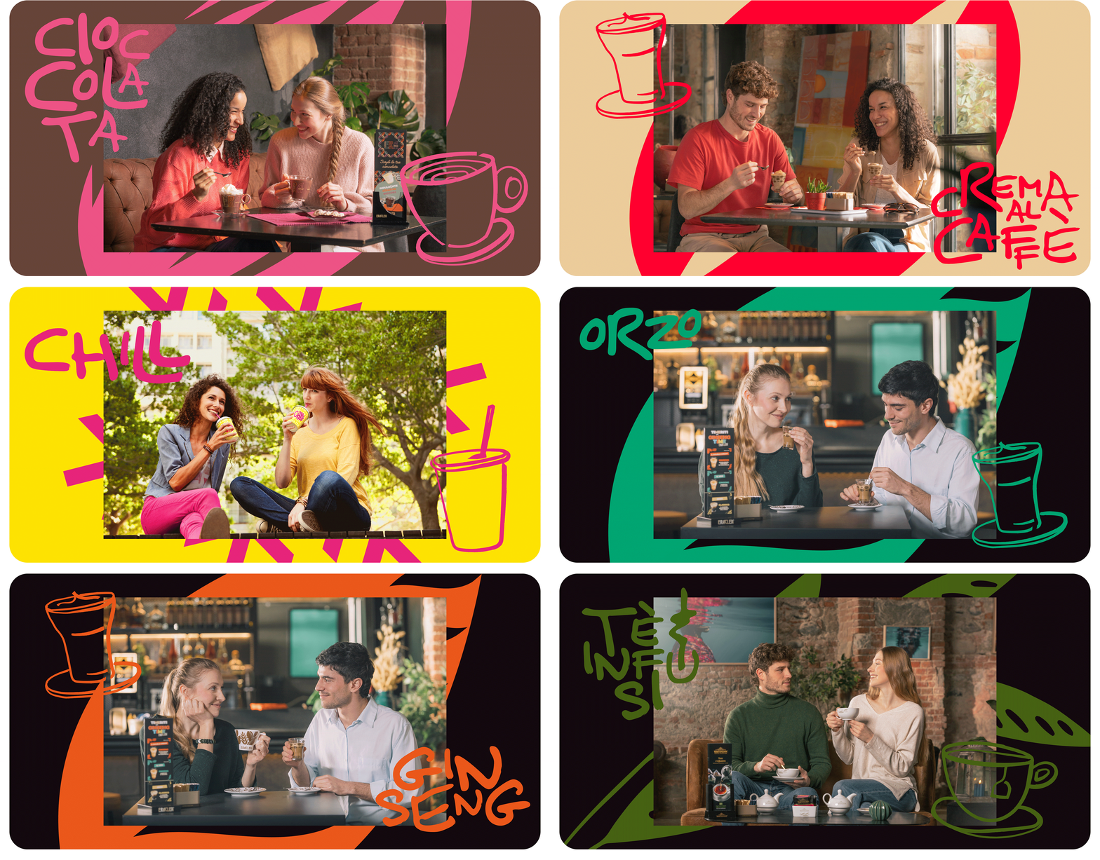
A structured color system locked everything into place. More than just a visual choice, it became a strategic tool, reinforcing the emotional experience behind each category. Every shade was selected to align with the moods at the core of the identity. This approach shaped the entire brand toolkit, defining typography, layout, and graphic elements to build a cohesive and recognizable visual language.
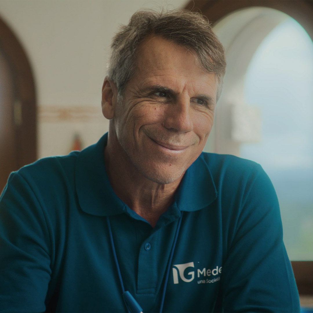
The shooting brought this strategy to life. Every shot was designed with precision, ensuring that composition, lighting, and styling reinforced the new identity. The final visuals cemented the connection between mood and color, turning the strategy into a recognizable and structured brand language.